

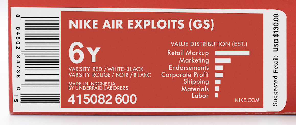
Nike Air Exploits is a conceptual packaging project that reimagines the familiar Nike shoebox to expose the hidden labor and economic systems behind consumer products. Rather than redesigning the brand, I preserved Nike's recognizable visual identity while replacing traditional product information with data about manufacturing, wages, and production costs. The familiar packaging encourages viewers to question the information brands choose to communicate—and what is often left unseen.
By working within an instantly recognizable consumer format, the project transforms everyday packaging into a tool for critical design. Instead of promoting a product, the shoebox invites viewers to reconsider how value is created, how labor is represented, and how design can challenge assumptions embedded in consumer culture.
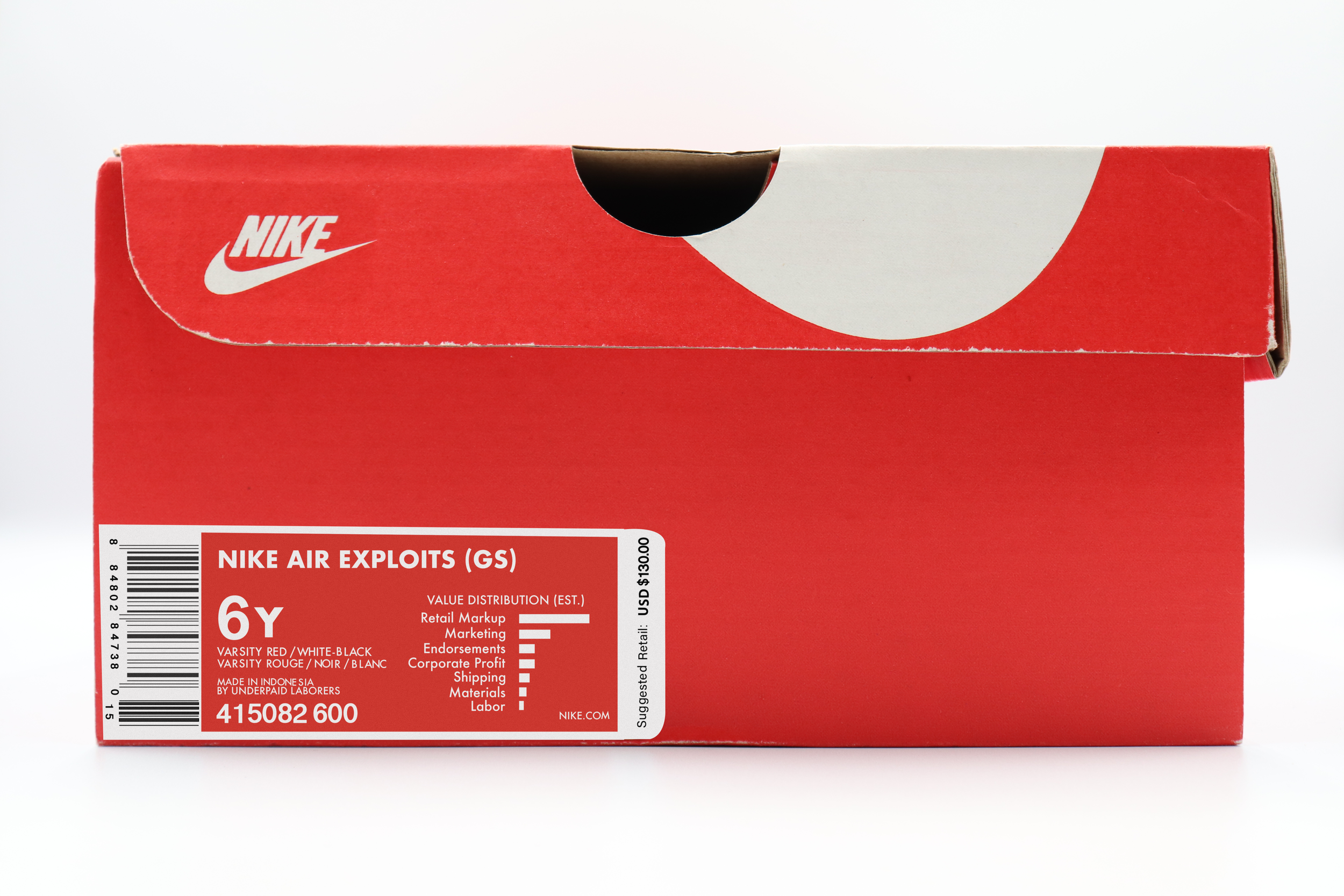
The project began by photographing an original Nike shoebox in a controlled studio setup to capture accurate lighting, texture, and perspective. I then recreated the packaging label in Adobe Illustrator, preserving Nike's typography, proportions, and visual hierarchy while replacing the original content with information that exposes labor conditions and the distribution of value.
The redesigned label was composited back onto the original shoebox in Adobe Photoshop using realistic texture, lighting, and surface integration techniques. This process allowed the intervention to feel authentic, reinforcing the illusion of a genuine retail product while encouraging viewers to look more closely at what familiar packaging communicates—and what it conceals.
Nike Air Exploits uses package design to expose the hidden systems behind consumer products. By preserving the familiar language of Nike packaging while altering its content, the project invites viewers to reconsider assumptions about value, labor, and consumption, demonstrating how design can challenge dominant narratives through subtle intervention.